WordTrove is a learning app designed to empower people to learn new vocabulary words. Users are able to review words in flashcard decks, add new words/definitions, set reminders to help fit learning into their busy schedules, and be challenged based on their experience level. This project was created for CareerFoundry’s User Experience Design course and was an exercise in the mobile-first design approach and usability testing using low-fidelity prototypes.
Goals
• To help user’s fit learning new vocabulary into their busy schedules.
• To suggest challenging vocabulary words based on user’s experience levels
• A means of reviewing vocabulary to help users study
• A way for users to add new vocabulary words and definitions
Tasks & Deliverables
Competitive Analysis, User Interviews, Personas, User Flows, Wireframes, Low-Fidelity Prototypes, Usability Testing & Reports
Process
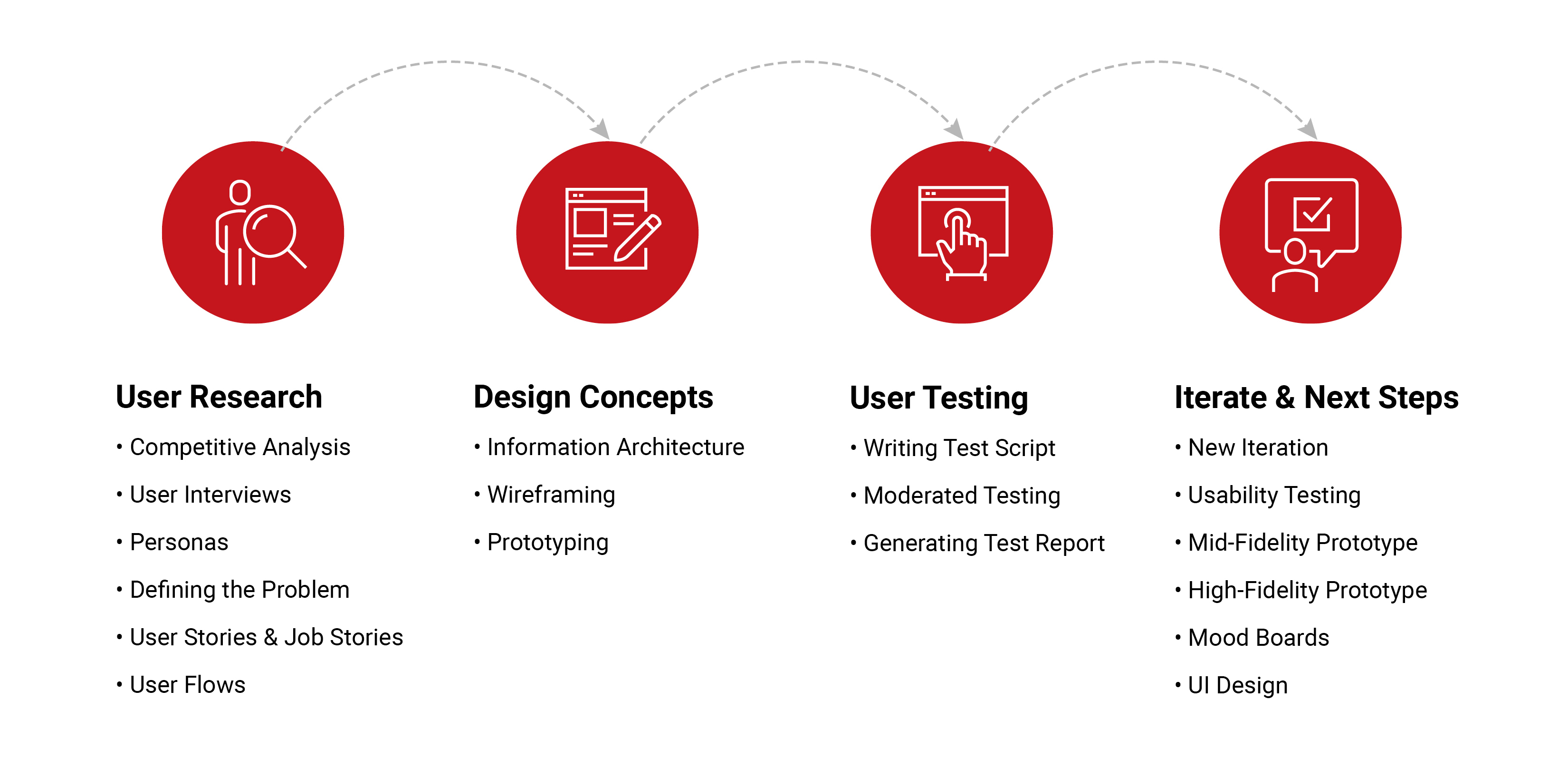
The first step in the design process was to understand the user through a competitive analysis of popular vocabulary learning apps, conduct interviews to gain insight into what motivates users to learn, creating a persona, and defining the problem and possible solutions. Creating user stories and job stories helped identify the persona’s needs and user flows to explore. Then design concepts were created for each user flow. I sketched out each screen from the flows to create a low fidelity prototype. The prototype was tested with users using MarvelApp. Feedback from each usability testing session was incorporated into the next iteration of WordTrove.
User Research
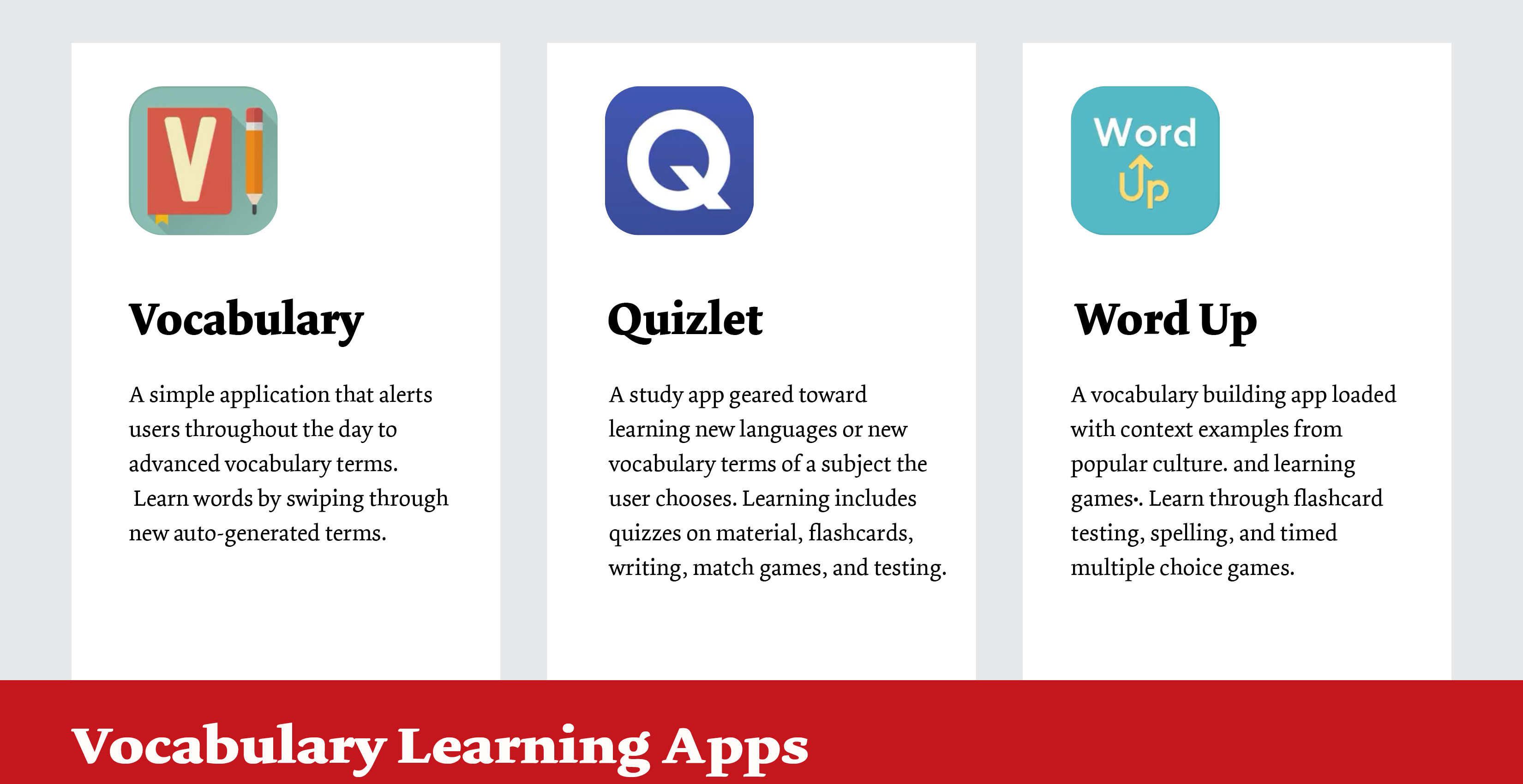
Competitive Analysis
In a competitive analysis, I researched three of the most popular mobile applications for learning new vocabulary.I compared each and evaluated success based on overall onboarding experience, ease of navigation, and interactive learning systems. The most successful vocabulary app of the three was Word Up because it met all of the criteria for simple onboarding, ease of navigation, engaging design and content. The interface design of Word Up is a balance of text with bright, stimulating colors and fun illustrations. The interactive flashcard system and games challenge users to use new vocabulary in real life situations and popular culture content. Quizlet included a lot of engaging interactive games to learn new vocabulary, however the interface design suffered from being too text-heavy. Vocabulary is a great simple application if you are just looking to be exposed to a few news words a day, but there are no memory tricks included to help with learning.
User Interviews
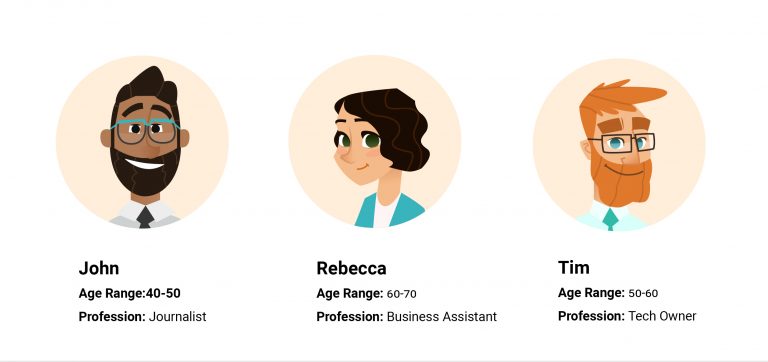
Five participants were interviewed to better understand how people approach learning a new subject and vocabulary. Each participant was asked seven open-ended questions to gain insights into what motivates them to want to learn new words, their favorite memorization techniques, and what types of devices they use.
Interview Questions
1. Are you a student, professional or both? What are some of your daily responsibilities and routines?
2. When was the last time you actively learned new vocabulary? Was it for work, school, training courses, or simply a topic of interest?
3. When you went to school, what were some of your favorite memorization tricks for studying for a test? What about techniques for learning new vocabulary? Were they different?
4. What are some of your frustrations when learning new terminology?
5. Do you have a favorite digital language learning application? What feature was most interesting to you? Did you use it on a phone, tablet or computer?
6. During the Pandemic over the past year have you or anyone in your family used any online learning applications that were beneficial? What did you like and dislike about them? How has your learning style changed?
7. What keeps you motivated to learn? What keeps you accountable in your learning?
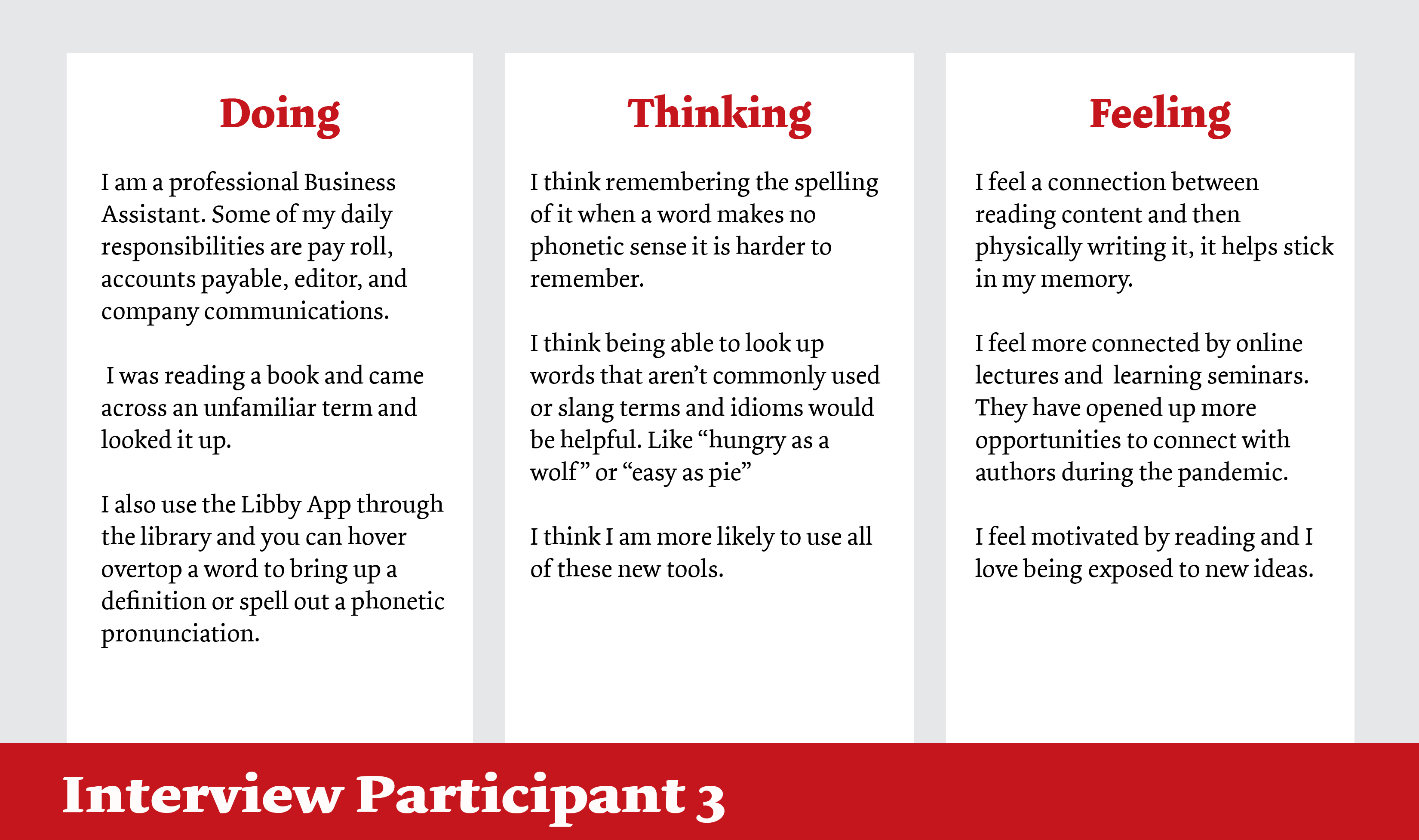
Analyzing Doing, Thinking, Feeling Statements
Statements made by each participant were organized into Doing, Thinking, and Feeling categories. Doing statements gave insight into a user’s every day busy life and challenges they may be presented with throughout their days. The Thinking statements described what features a user would be looking for in a product. The Feeling statements highlighted what motivated users or made them feel a connection to an application. I found frustrations statements to be great feedback to discover user pain points to avoid.
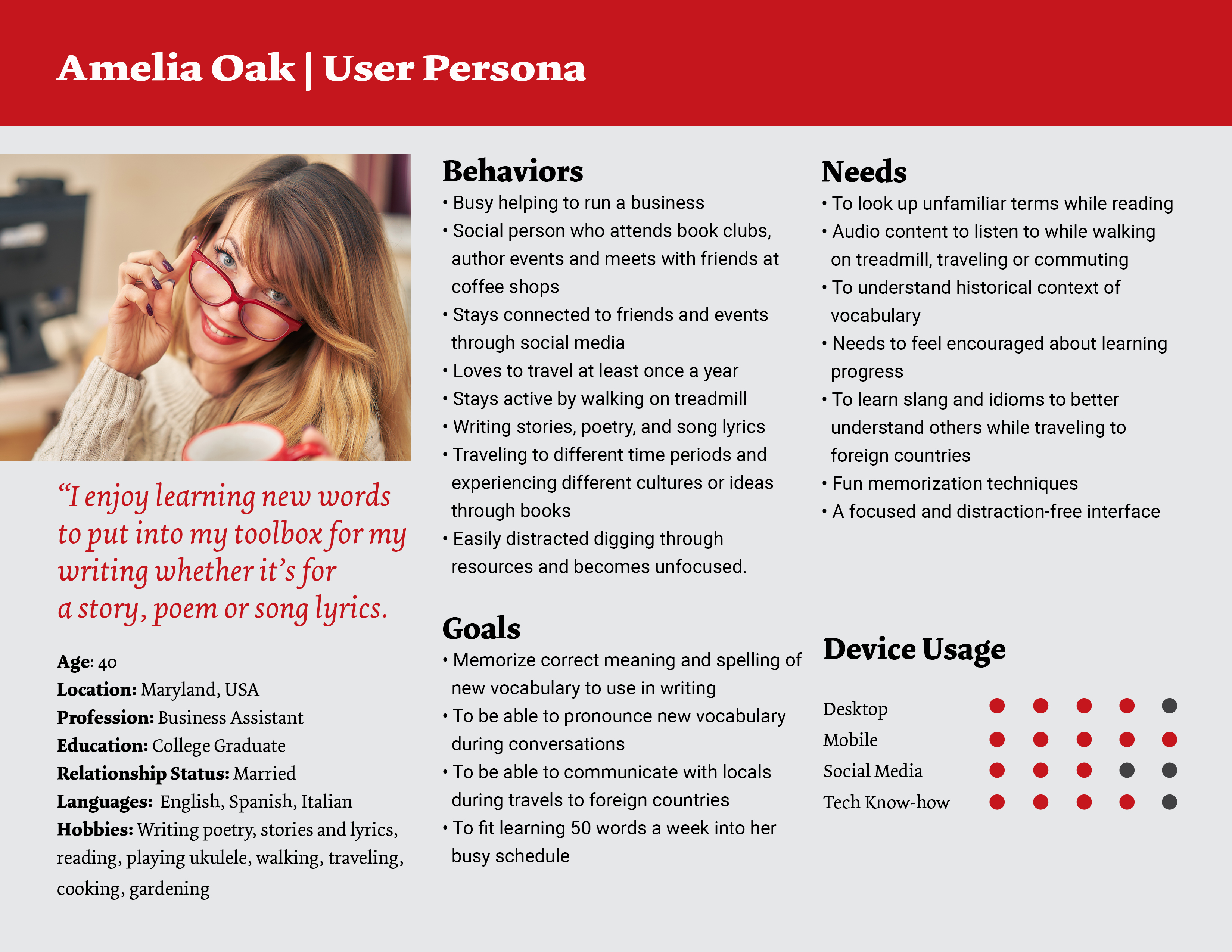
Creating a Persona
Based on interview feedback, a proto-persona of Amelia was created with demographic information, behaviors, goals, needs and device usage.
User Stories
As a busy professional who juggles a hectic work/life schedule I would like reminders to work on vocabulary as well as audio content so that I can set aside a block of time to memorize words and listen to pronunciations while I exercise.
As a writer, I want to memorize new vocabulary to keep in my toolbox so that I can create more interesting and engaging content.
As a reader and lover of historical fiction, I would like a way to look up unfamiliar words and understand their historical context.
As a world traveler, I want to learn foreign language and idioms to better communicate with fluent speakers.
As a social person, I want to be able to understand the context and pronunciation of new words so that I can say them correctly and confidently.
As a social person, I want a way to reach out to other readers and authors so that I feel connected to community.
As someone who is easily distracted, I want a distraction-free interface and the ability to see my progress so that I can focus on studying and feel motivated in my learning.
Job Stories
When I log in to the application, I want to be able to use Facebook or Google so I can create an account more easily and quickly.
When I am writing, I want to use new words so that I can effectively express myself and create more sophisticated content.
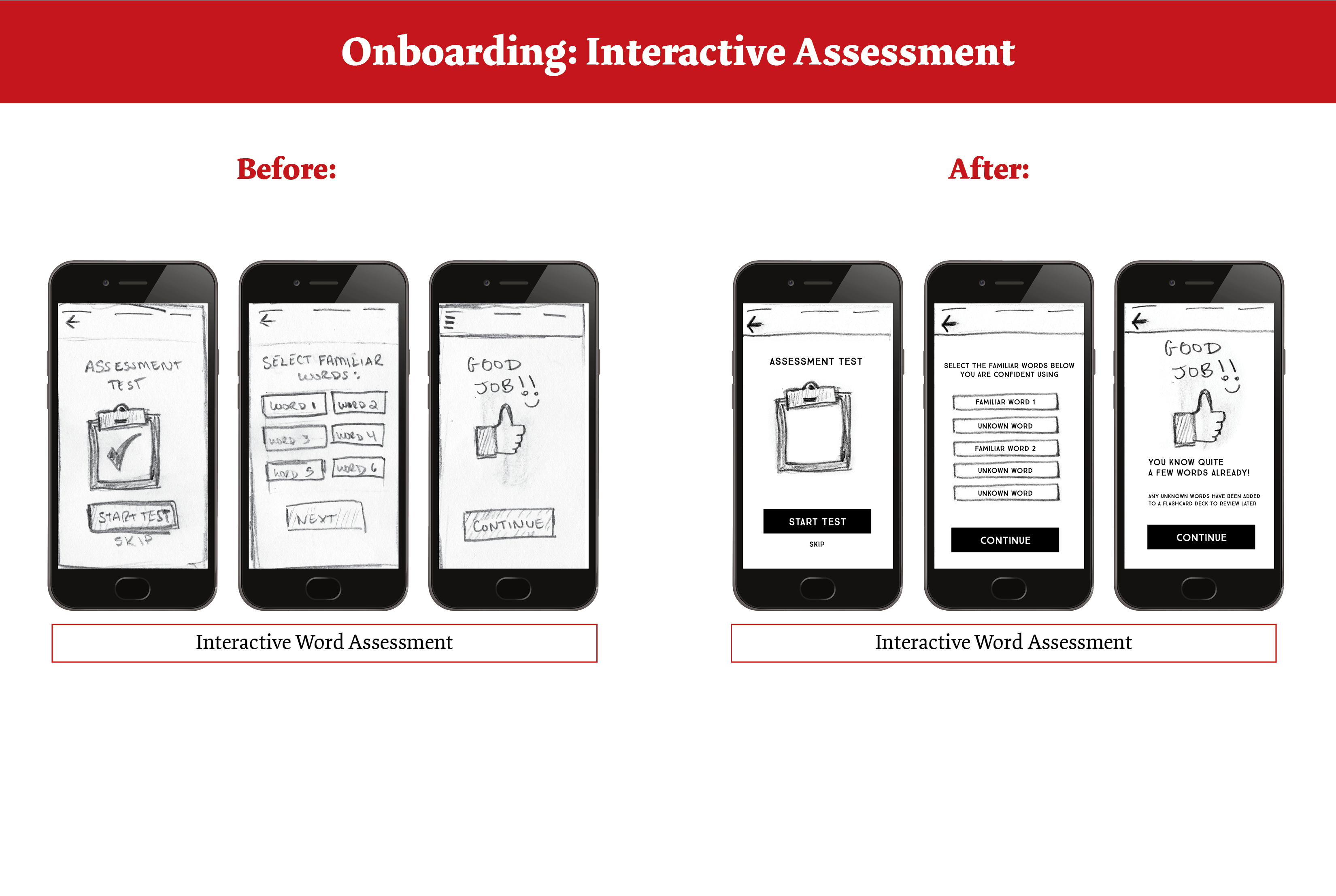
During onboarding, I want to take a vocabulary assessment so that I can focus on learning only unfamiliar words.
While using the application, I want a navigation system similar to the social media apps I am familiar with so I can easily navigate.
When I am memorizing words, I want a clean interface free from the time and distracting notifications, so that I can focus on learning.
When I am exercising, I want to listen to audio content so that I can practice pronunciation.
Defining the Problem
Problem Statement
Amelia needs a quick, fun way to memorize new vocabulary because she would like to expand her toolbox of words for her personal writing projects and foreign language to better communicate while traveling.
We will know this to be true when we see Amelia use new words in her writing, understand their context, and pronounce them confidently in social situations and while traveling to foreign countries.
Hypothesis Statement
We believe that by building a vocabulary learning application which includes: a word search feature, variety of fun memorization games, audio pronunciations, learning progress bar, distraction-free interface, and social community we will achieve a fun, focused avenue for Amelia to memorize, pronounce, and correctly use new vocabulary to use in her writing toolbox and travels abroad. It will also help fit into her busy schedule, track her learning progress and keep her engaged and motivated.
Design Concepts
Task Analysis & User Flows
To begin exploring the information architecture of WordTrove,I wrote Task Analyses and drew User Flows for the main features that I thought Amelia would like from an app that teaches new vocabulary words.
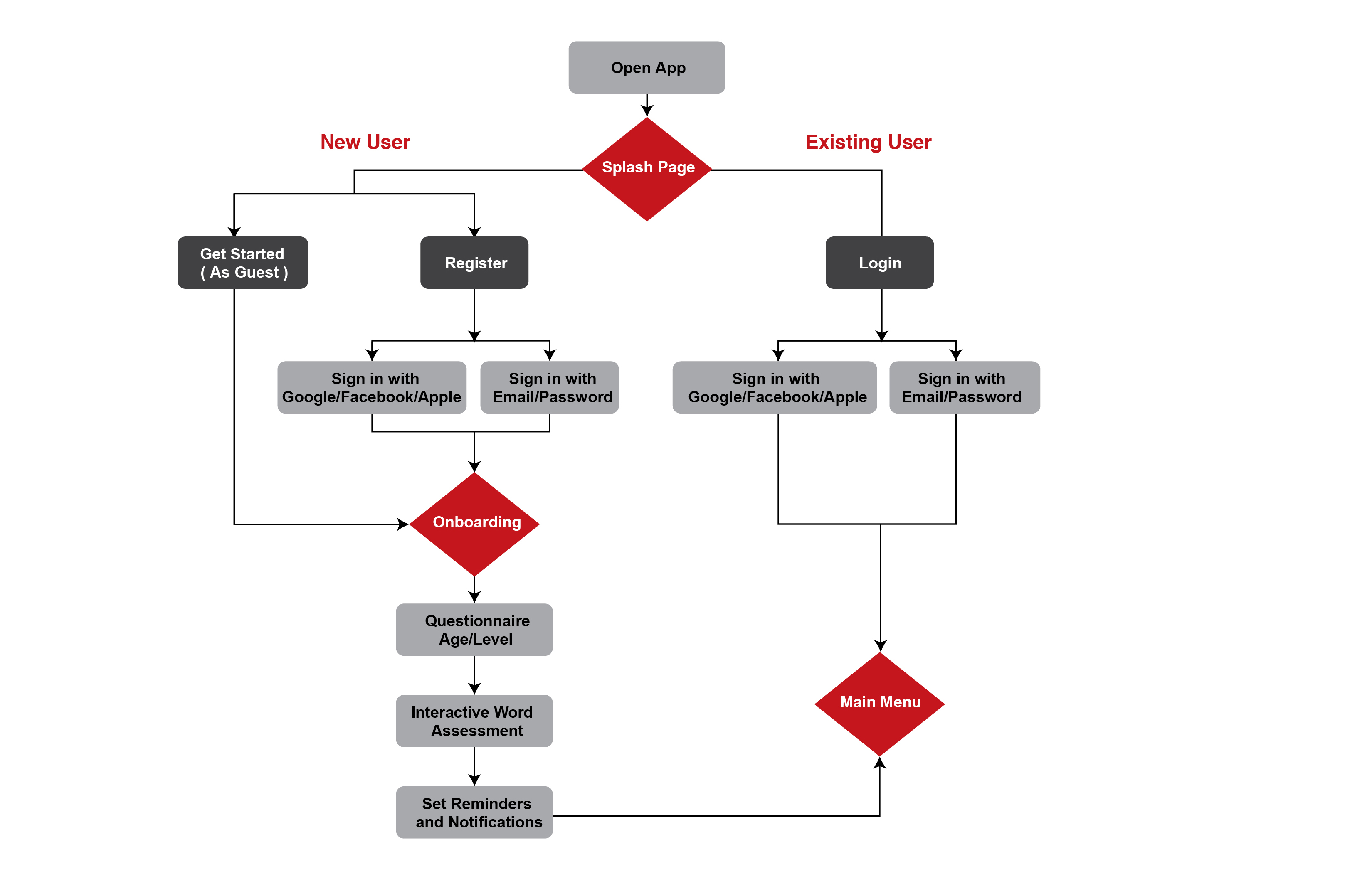
Onboarding User Flow
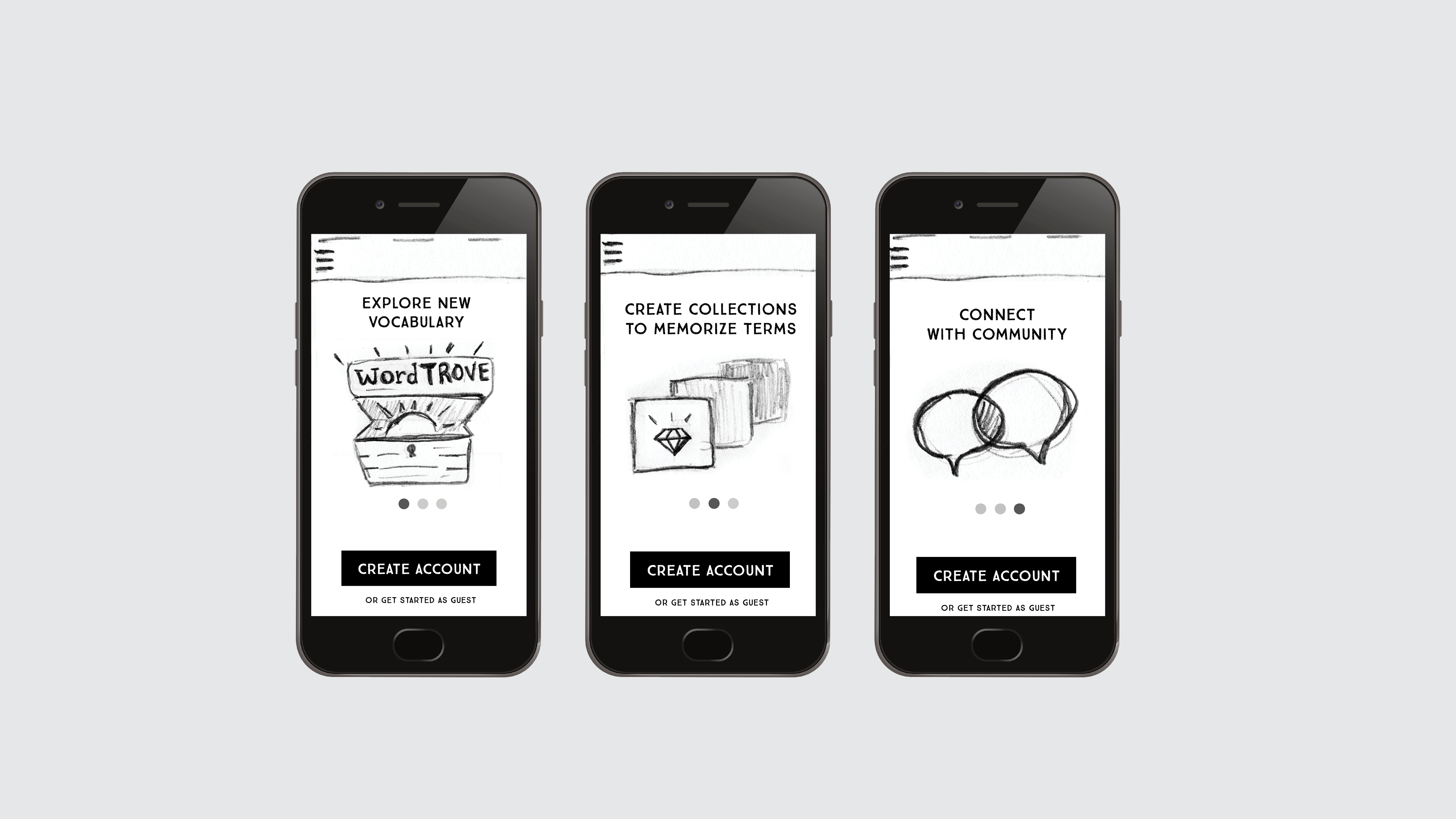
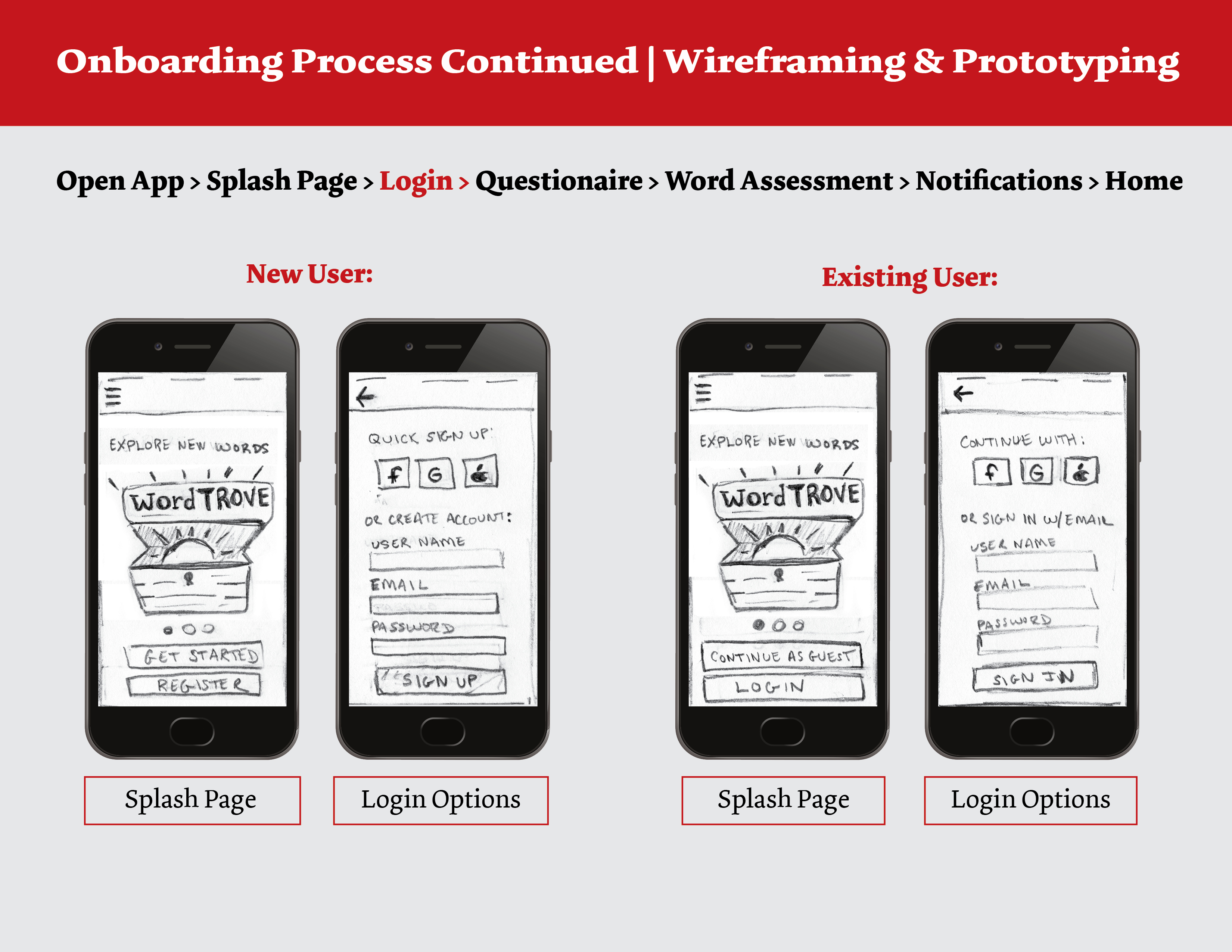
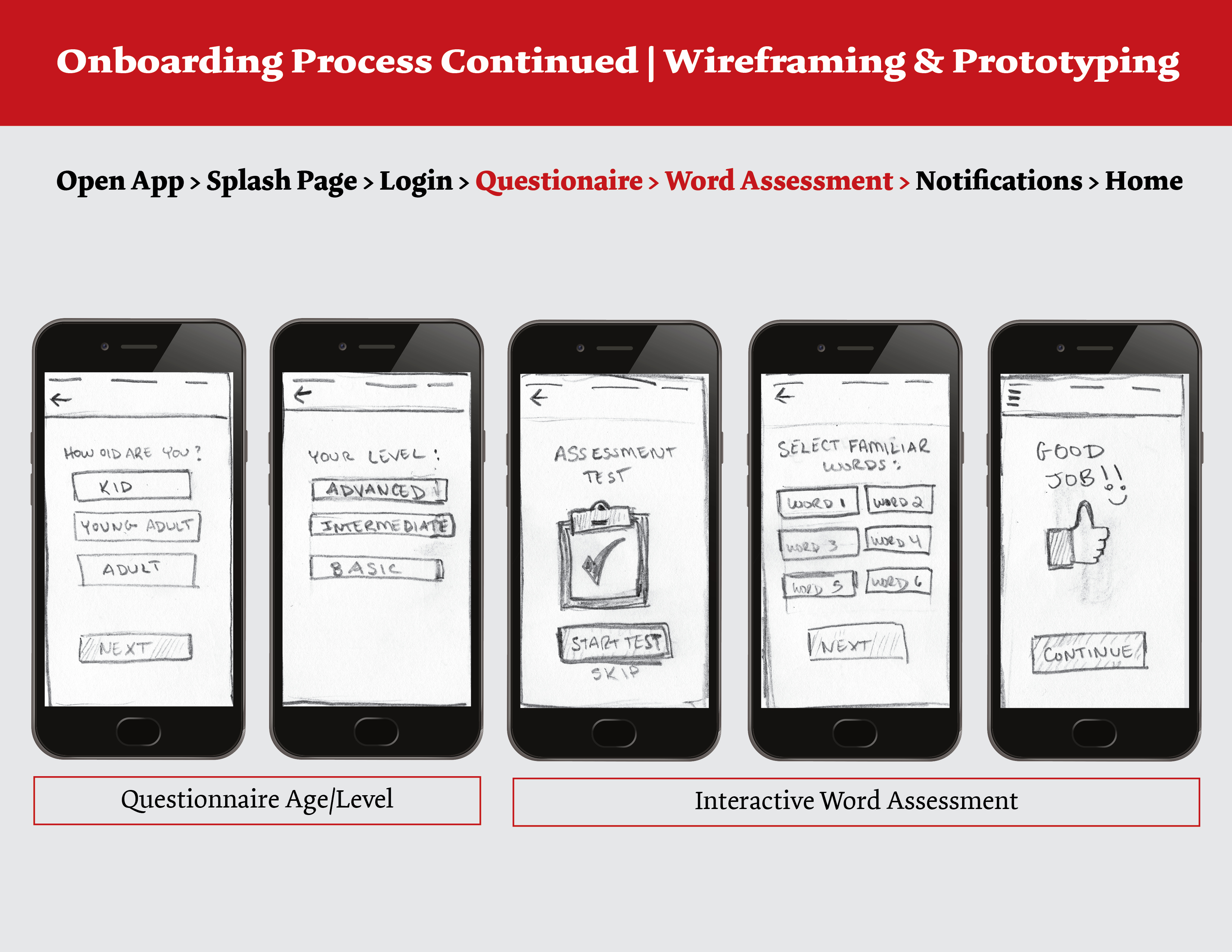
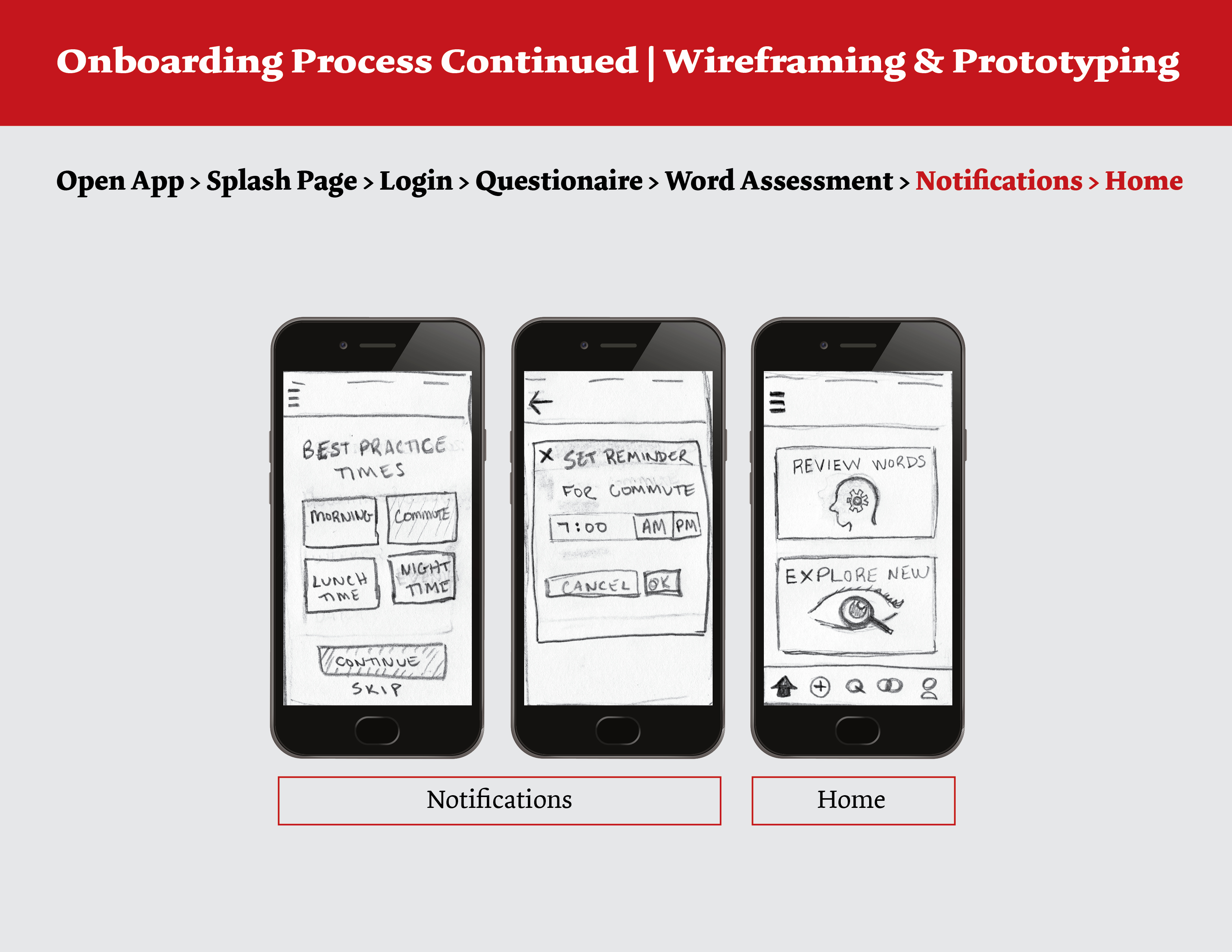
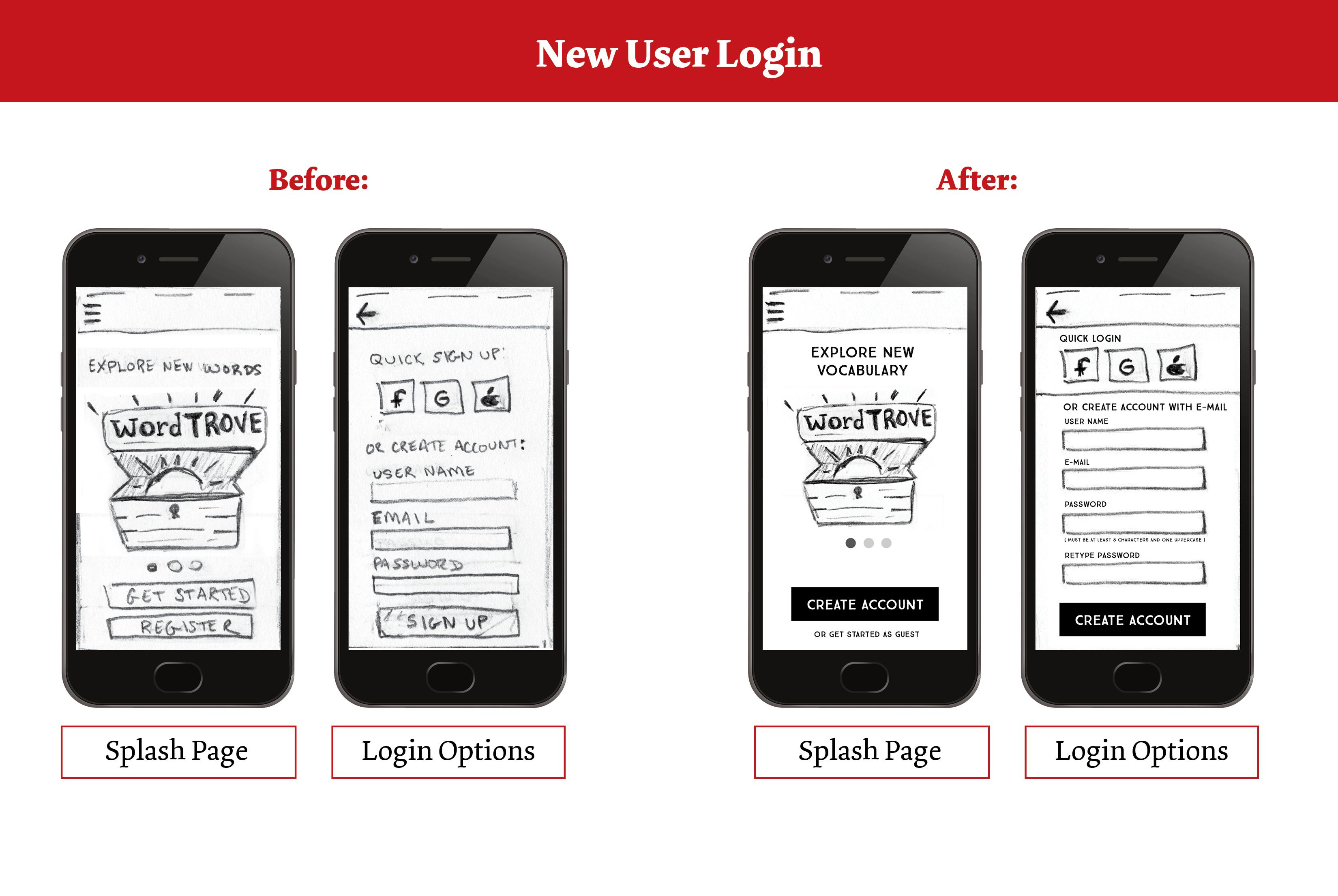
For onboarding, the entry point was defined as opening the app and success criteria was to arrive at home/main menu. For both new and registered users, logging in via e-mail or social accounts (Google, Facebook, Apple) were options. For new users, I included an option for continuing as a guest, so that users could test out the app before signing up. A questionnaire and assessment test were included in onboarding to create a challenging first deck of flashcards for users.
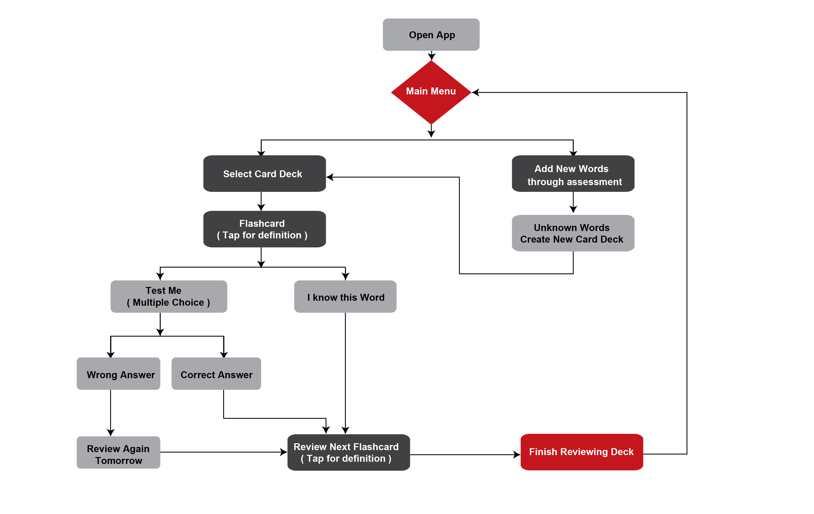
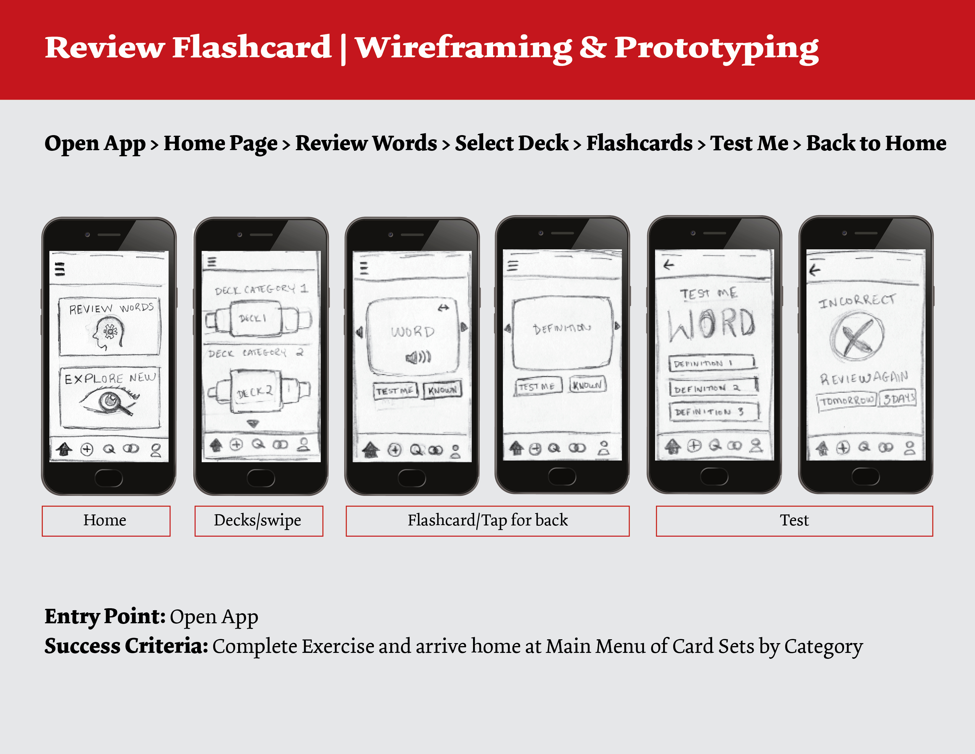
Review Flashcard User Flow
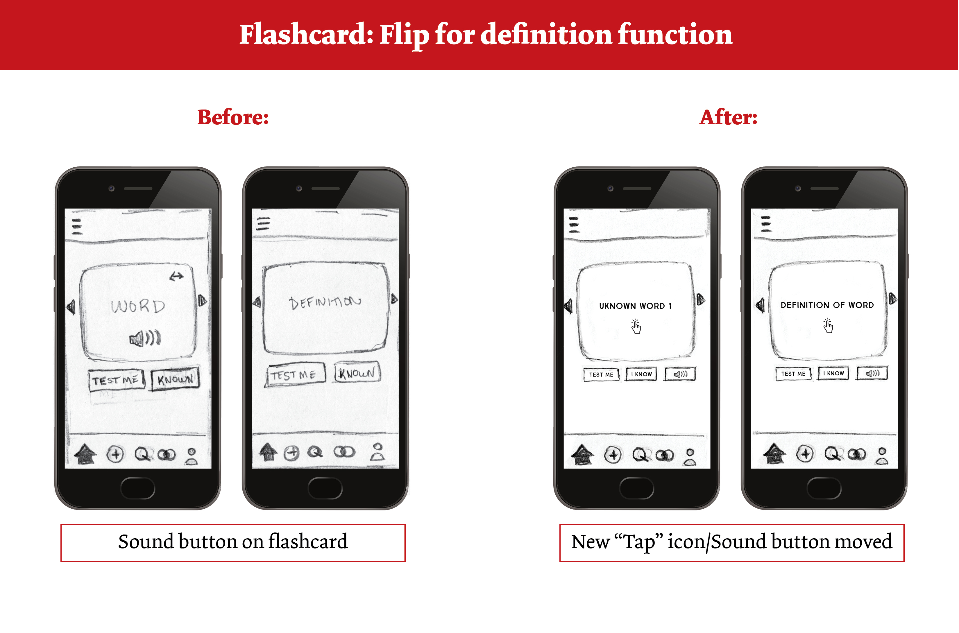
The entry point was opening the app and success criteria was completing the exercise to arrive home at main menu of cards sets. Flashcard word options included a multiple-choice definition list when users select “test me”. If a test was wrong, the card is added for review the next day or session.
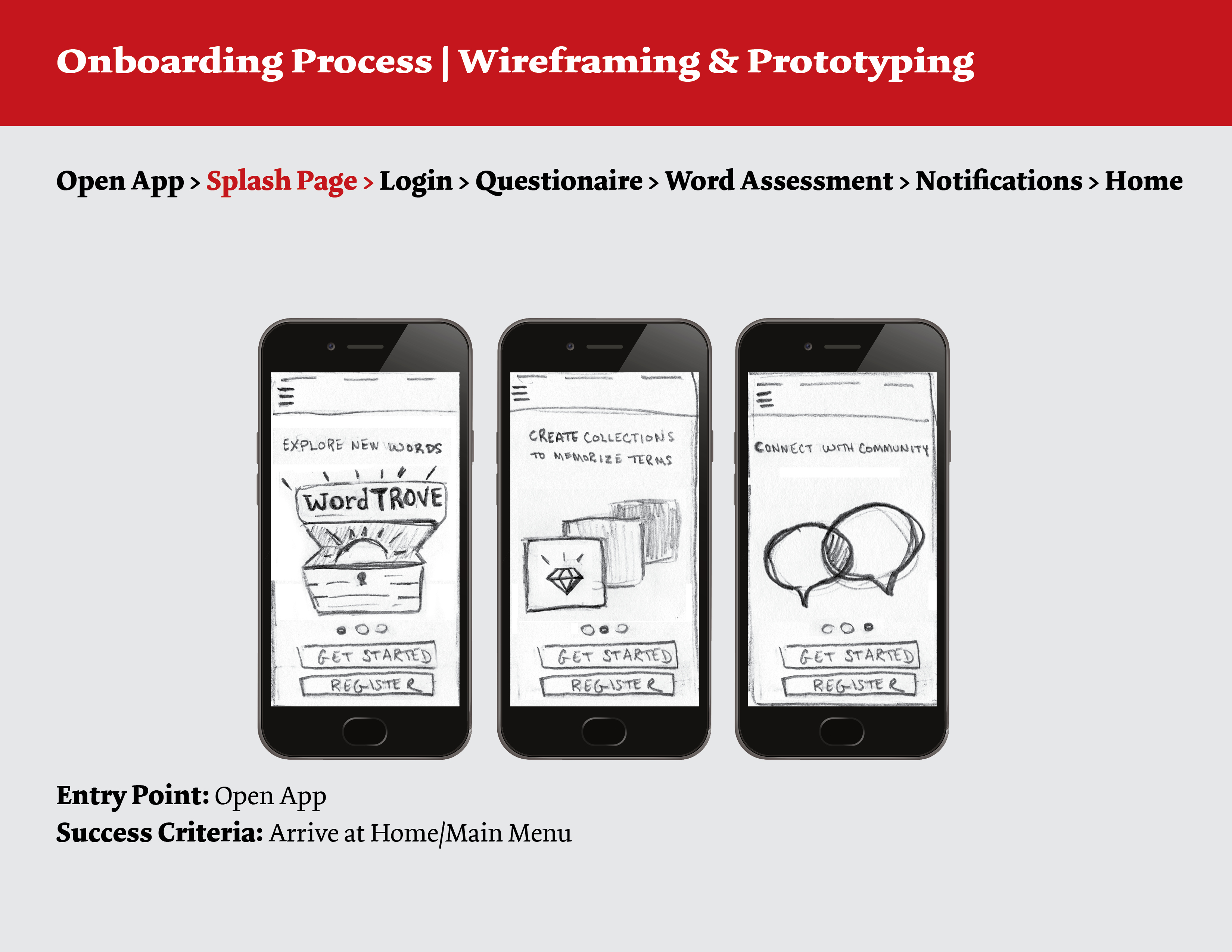
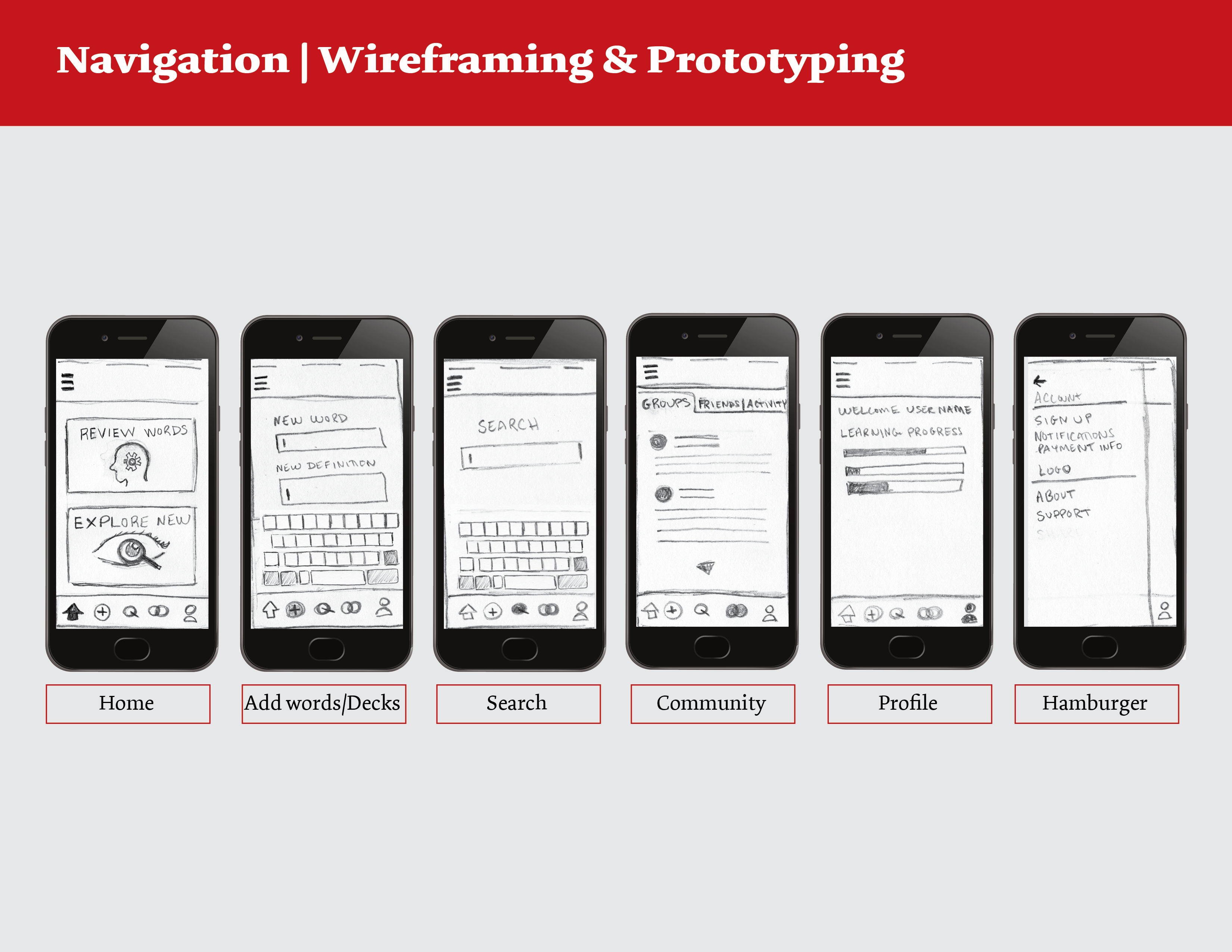
Wireframing & Prototyping
Based on the user flow diagrams, I sketched wireframes for the main navigation pages and flows. I then created a low-fidelity prototype in MarvelApp to test with users.
Previous
Next
User Testing
Three participants who have used digital learning applications were chosen for the usability testing study. Participant ages ranged from 30-65 and were selected from my personal network. Testing sessions were either moderated in-person or remote and took 20-30 minutes to complete. Participants were asked background questions and completed four short tasks to test the site’s navigation and overall ease of usability. Using the Jakob Nielsen’s error rating scale, I created a Test Report of issues and prioritized by severity.
New Iteration & Next Steps
New Iteration
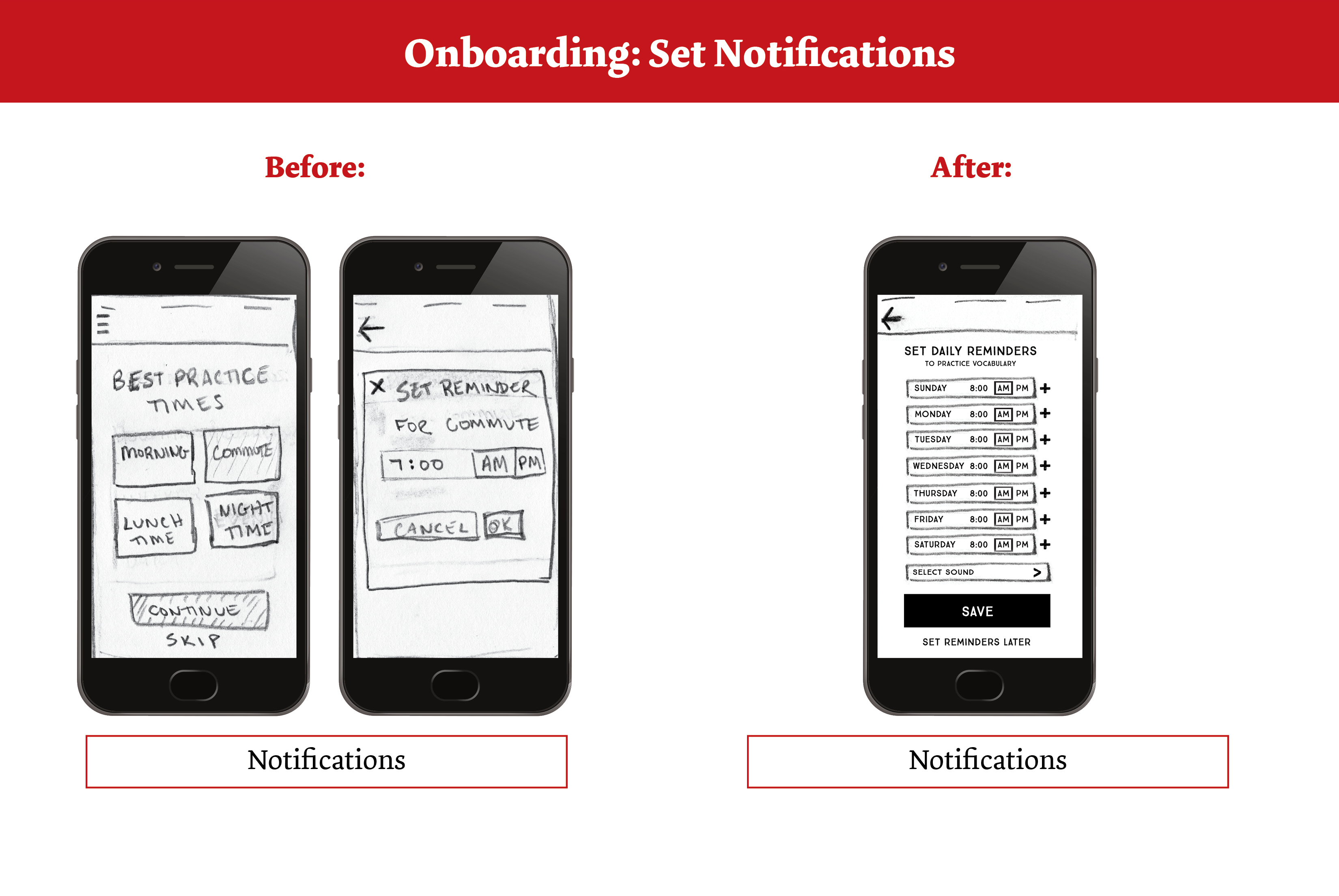
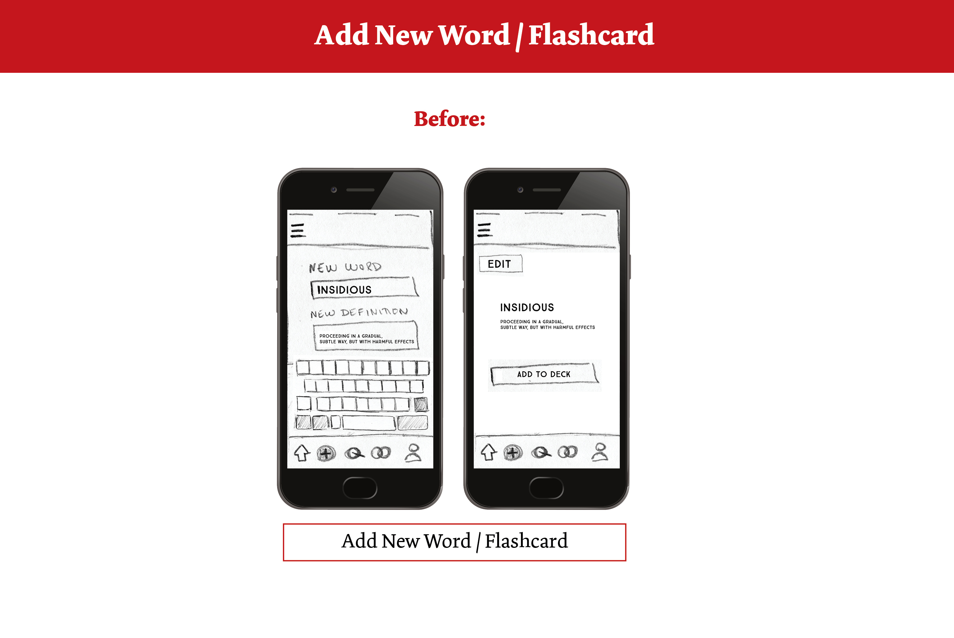
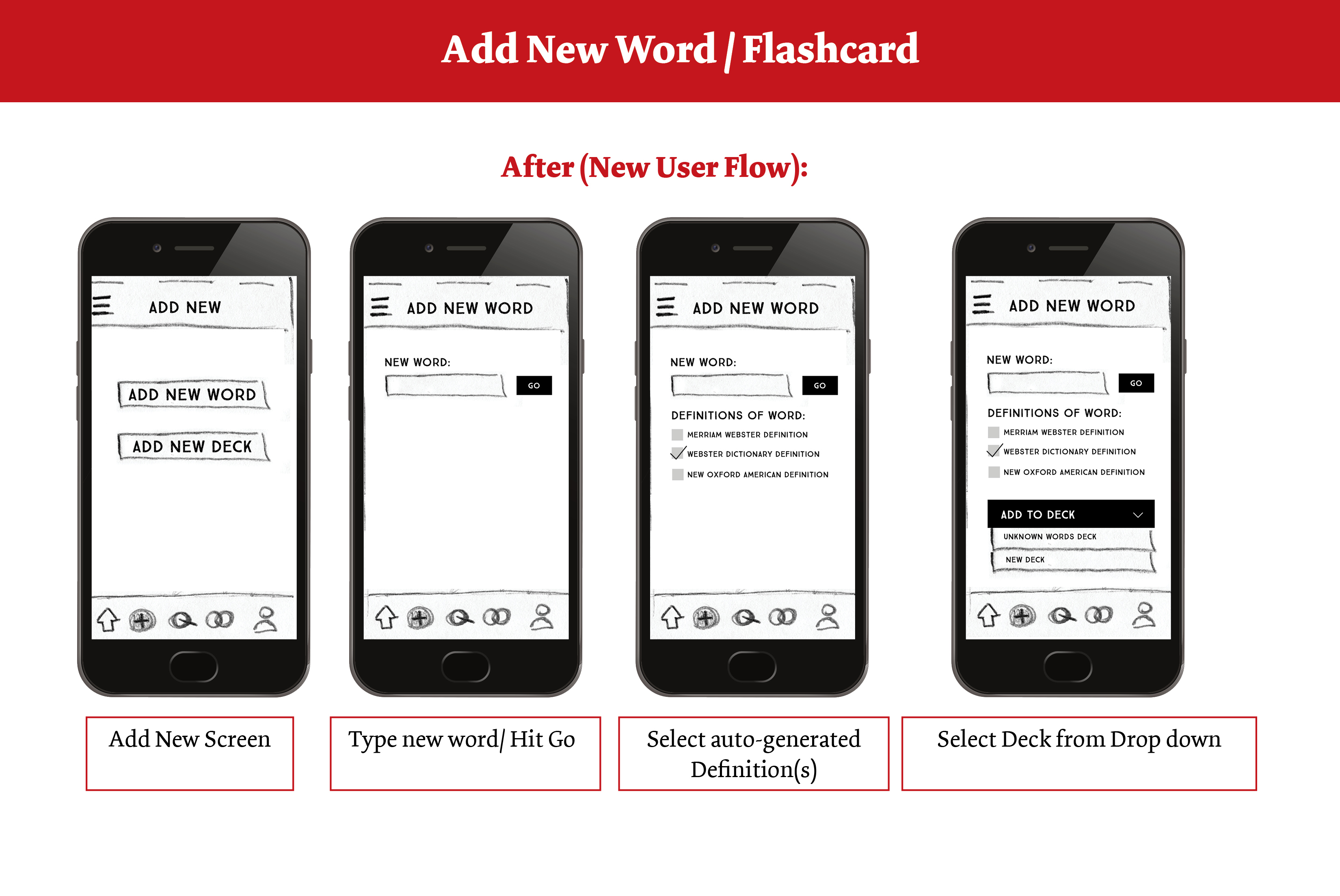
Based on feedback from participants during usability testing, a new low-fidelity prototype was created. Users thought “Get Started and Register” were too similar so it was changed to “create account” or “get started as guest”. Emphasis was also added to “create account” button. During the onboarding interactive assessment test, more information was added to make it clear that the unfamiliar words were put into a new deck to review later. During onboarding rather than choosing morning, afternoon, or evening, participants preferred to have a button for each day of the week where they could toggle to set a time. Participants were confused about the sound button on flashcards so it was moved under the flashcard with the other button options. Users also felt that would benefit more from choosing pre-determined definitions from different dictionaries instead of putting in their own definitions because they might have the definition wrong, therefore learning it incorrectly. A new user flow was added to include selecting preferred dictionaries and sources for definitions.
Previous
Next
Next Steps
The next steps would be to re-test and iterate. After testing the new low-fidelity prototype, creating a mid-fidelity and high-fidelity prototypes. Next, I would create mood boards and perform preference testing to help create the visual design and user interface.